PRM was definitely a change of pace as far as the modeling environment is concerned. We pretty much had to dedicate ourselves to proper edgeflow, sillouette, and knowing when and where to add geometry. Pretty much a piece of cake for me, as I’d hope by know I’m quite familiar in the case of modeling. Hardsurface anyway. In this class we started out with a hard surface object, ranging from cameras to a computer mouse… Basically anything with “ergonomic” in the description. We had to emphasis the use of three types of surfaces; SubD, Poly, and NURBs. So, after analyzing my options, and what I had on me at the time, I decided to use my Nikon L2 Coolpix as the best opportunity to get the ball rolling.
So, if you’re reading this blog you MUST have some sense as to what I’m talking about when I refer to the fact that I don’t necessarily box model. I use CV curves based off of image planes to capture the idea of volume the model is taking, and using the curves I build my surfaces, usually out of NURBs, then convert to polys.
After the CV curves are laid out, I go ahead and start using the Birail tool, along with Loft and even Project Curve onto Surface. This allows me to start building my basic surfaces, and gets me moving onto complex surface structure while keeping the surface smooth and bump free.
Going along with that, I tend to add more CV curves, but also use the reference images to help me guide what surfaces have certain qualities, such as initial curve radius, and how the surface transforms from one end to another. The result can be more detail in specific areas, while keeping the surface flat and not so terribly deformed.
The ending result, well, is the final product. Here I did some quick renders with a simple area light. Don’t rate me on the lighting or anything, this is just to show the surface itself.
So needless to say, my Hardsurface assignment went really well. Along with just creating it, we had to make it to scale. Which, with my background in doing CAD for four years in my High School Trade shop, I know how to do this quite well and quickly. I was almost sad that I wasn’t making this camera in Solidworks and converting it to .obj and bringing it into Maya. While that may have been an awesome idea (I know, right?) It simply wouldn’t do, as the geometry interprets differently and would automatically triangulate itself.. Bummer. I could export them a different format, which would convert them all to NURBs, which would make total sense, but I’ll do that for another assignment, and when I get to dive into Solidworks again… CAD ’08!


History aside, we still had one more project to do: Character Busts! But not just any character… Ourselves… The lab instructors had us posted against a wall with a grid, taking pictures of our front, side, 3-quarter, top and bottom of our face. The point of the grid was to help correct the perspective of the lens they were using, so the lines don’t give us barrel distortion which otherwise skews our face. If you don’t know what I’m talking about take this for example: Hollywood actors are normally shot with a telephoto-lens – not because the Papparazzi is trying to sneak on them doing stuff normal people do, but because the lens flattens the perspective, forcing features like a big nose or big forehead to fall flat with the background. You’ll also see that when you see sports photos, where it looks like the crowd is directly behind the player, but this is all due to the shape of the lens that is telephoto. Wide angle, however, is used in things like, I don’t know… Recording animals up close with a wide angle lens (South Park, anyone?) The features that are closest to the camera appear larger by a greater deal than in the background, skewing perspective. This would otherwise give us different results when modeling our busts, so correcting the lens is a major must when working with photos.
So, after our glamorous photo-shoot (and I use that word lightly), we began with a basic…. ‘thing’ to begin our sculpt. I say thing because it looked more like one of those stress-squeeze things than it resembled the shape of a human head. Our objective was to take this thing, and shape it so that we got basic proportions correct. The first image was after a few sub divisions and moving the mesh to fit proportions a little better. (you can’t handle the ‘thing!’)
So, talking aside, I’ll upload the progression of the mesh as I pushed and pulled and modeled to the best of my ability my own bust.
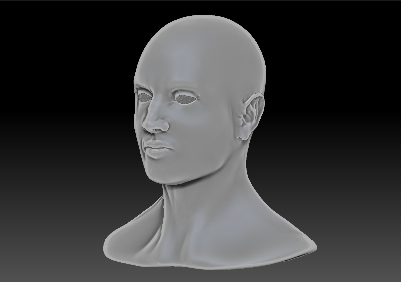
So after all that 2.5D (that’s right, two-anda-half Dimension) modeling, I had to go in and re-topologize the whole mesh, which went something like this:


So that was a fun little run. The point of re-topologizing was to make it capable of being brought into Maya to be rigged, textured, animated, and all sorts of stuff. Interesting, eh? Well, here’s the final results:


So the final result was quite satisfactory. While I found it extremely difficult actually trying to go through and model myself, I was pretty happy with where it came out. Not bad, anyway. There was the option to add hair to the model, but I didn’t feel the need, as I don’t really want to be a character modeler anyway. Don’t get me wrong, I like modeling, I feel like everyone should be able to do it, and do it well. But I want a challenge, and Compositing is that challenge.
– endy

